
Crafting My Medibank’s first design system
About Medibank
Medibank is Australia’s largest healthcare insurer, looking after the healthcare insurance needs of more than 3.8 million customers through the Medibank and ahm brands, distributing travel, life and pet insurance products. In addition, Medibank provides a range of health services in Australia including mental health support, preventative and better-integrated primary, care and after-hours health support.
Project
Overview
My Medibank (MYM) is Medibank’s self-service platform for its 3.8+ million Australian members. Kicking off in 2019, the My Medibank Design System was the self-service platforms first-ever design system and ran concurrently with the My Medibank Redesign. The entire Medibank design team consisted of 4 designers, each one dedicated to other projects, the My Medibank Design System was my responsibility, I had the chance to craft something awesome that would help millions of people.
At the same time, the creation of the Retail Web Design System (Medikit) had already kicked off, with plans in place to kick off the design and execution of a Medibank App Design System (Helix) within 6-12 months.
My role: Product Design Lead
I led the end to end research, design, execution and management of the My Medibank Design System, from its initial launch through to its current version. Being My Medibank’s first-ever design system, my focus was to understand design system best practices and leverage their strengths for the success of the My Medibank Design System. Along the way, communicating the benefits of design systems and building strong relationships with various digital and business stakeholders.
Responsibilities included:
• End to end product strategy and design.
• Creation and management of the responsive My Medibank Design System.
• Managing communication between engineers, legal and business stakeholders.
• Translating business needs into actionable design plans.
• Research recruitment and facilitation.
• Liaise with My Medibank app and Retail Web team to ensure cross-platform consistency in their design systems.
• Facilitation of brainstorming/ideation workshops, design reviews and presentations.
Tools used
Figma, Zeplin
Timeline
February 2019 – Ongoing

The goals
The overarching goal was to design and create a unified design system that would allow us to build better and faster. It would lead to easier comprehension by our users (i.e. reduced cognitive load) and would give the team a common design language to work with, allowing the team to build a better and faster product.


The challenges


“A unified design language shouldn’t be just a set of static rules and individual atoms; it should be an evolving ecosystem.”
— Airbnb

Getting to work
How others did it
I had built design systems in the past, but not to this size or scale. The creation of the Retail Web Design System (Medikit) had already started a few months back, I took the opportunity to sit with that team as they workshopped the Medikit Design System. This allowed me to glean some learnings from that team (the good/the bad/the ugly), but that was never going to be enough. I read medium articles, studied the guidelines and principles laid out by Atomic Design, Apple, Airbnb, and Atlassian, and searched for other designers who faced a similar challenge.

Sample of the guidelines and design language systems that I researched.
Gathering everything we already had
Without the existence of even a basic style guide, my next task was to inventory every UI element in My Medibank. I accessed various test environments and took screenshots of every page, modal, menu, and well everything in the application. Once I felt as though I had every UI element within My Medibank I then grouped them into relevant categories. Seeing a holistic side-by-side comparison told the story of just how much the application needed a design system. There were dozens of styles for very similar UI elements (buttons, forms, modals, input fields, messaging panels, etc).

Left image - Screenshots of existing screens with unique UI elements highlighted. Middle/right image - UI elements grouped into categories.
Laying down the foundations
Crafting a design system for My Medibank wasn’t simply a case consolidating the existing UI elements, I had to take into that there would be shared UI elements between the My Medibank Design System, Retail Web Design System (Medikit) and in principle, the Medibank App Design System (Helix - kicking off 6-12 months later) would share elements.
Some of the common elements included typography, colour, grids and spacing. Applying this consistency across both systems was essential for the business and users. Users viewed/interacted with these elements as they browsed/purchased Medibank product(s), then they would interact with the same foundational elements in My Medibank, creating a more unified experience for our users.

Some of the common elements between Medikit and Me Medibank Design System - Left image - Buttons. Middle image - Input fields. Right image - Bootstrap grids
The future is not known
There were many unique types of pages needing platform-specific solutions, some of these included:
• Updating their details
• Viewing policy information
• Making claims
• Viewing their limits
As the redesign of My Medibank and creation of the My Medibank design system ran in parallel, I didn’t have the luxury of redesigning the entire platform at once, the only way for us to build the system was one feature/page(s) at a time, I had to have one eye on the now and one eye on the future. This meant keeping in close communication with our team (development team/product/brand/senior executive team, etc) and the retail team to share how each of our platforms and design systems were and/or planned to evolve.

The initial release plan for the My Medibank redesign gave a high-level overview of some of the components that would be needed for the design system.

Constantly whiteboarding possible solutions with developers and Medikit designers.

Wireframed initial solutions from discussions with the team for review and further refinement.
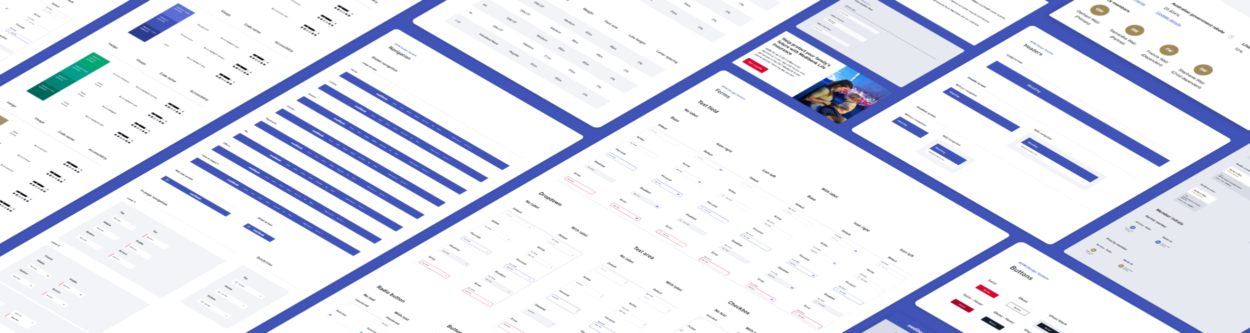
Compiling the library
I created a component library in a master file, initially in Sketch and later into Figma/Zeplin, which was referred to by design and development teams. When creating or iterating on designs I saw a massive productivity improvement, one day I was able to put together an entire flow (30+ screens) together in a few hours instead of days using the old designs. As the library evolved and became larger organisation became more important, especially as I started leading other designers and they started constructing layouts.

Subset of component library.

Ability to select, swap component instances and nested symbols within Figma.

The solution
Introducing My Medibank’s first design system


Achieving the goals
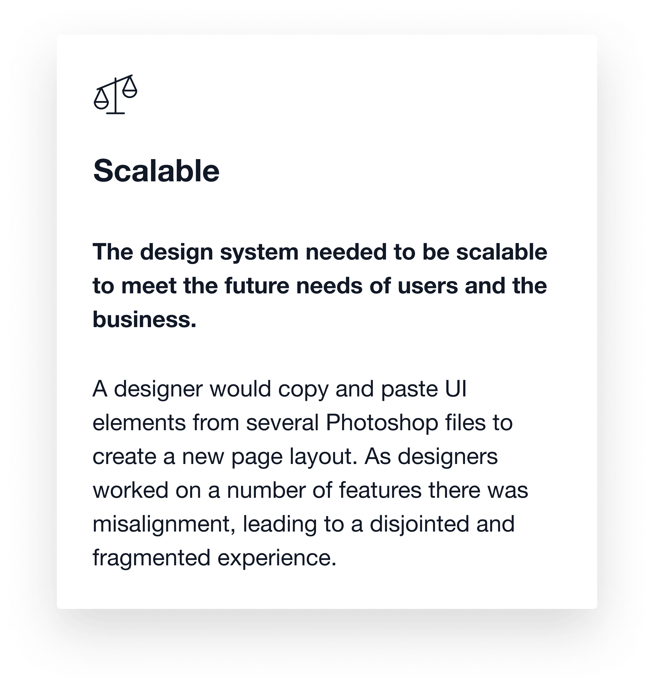
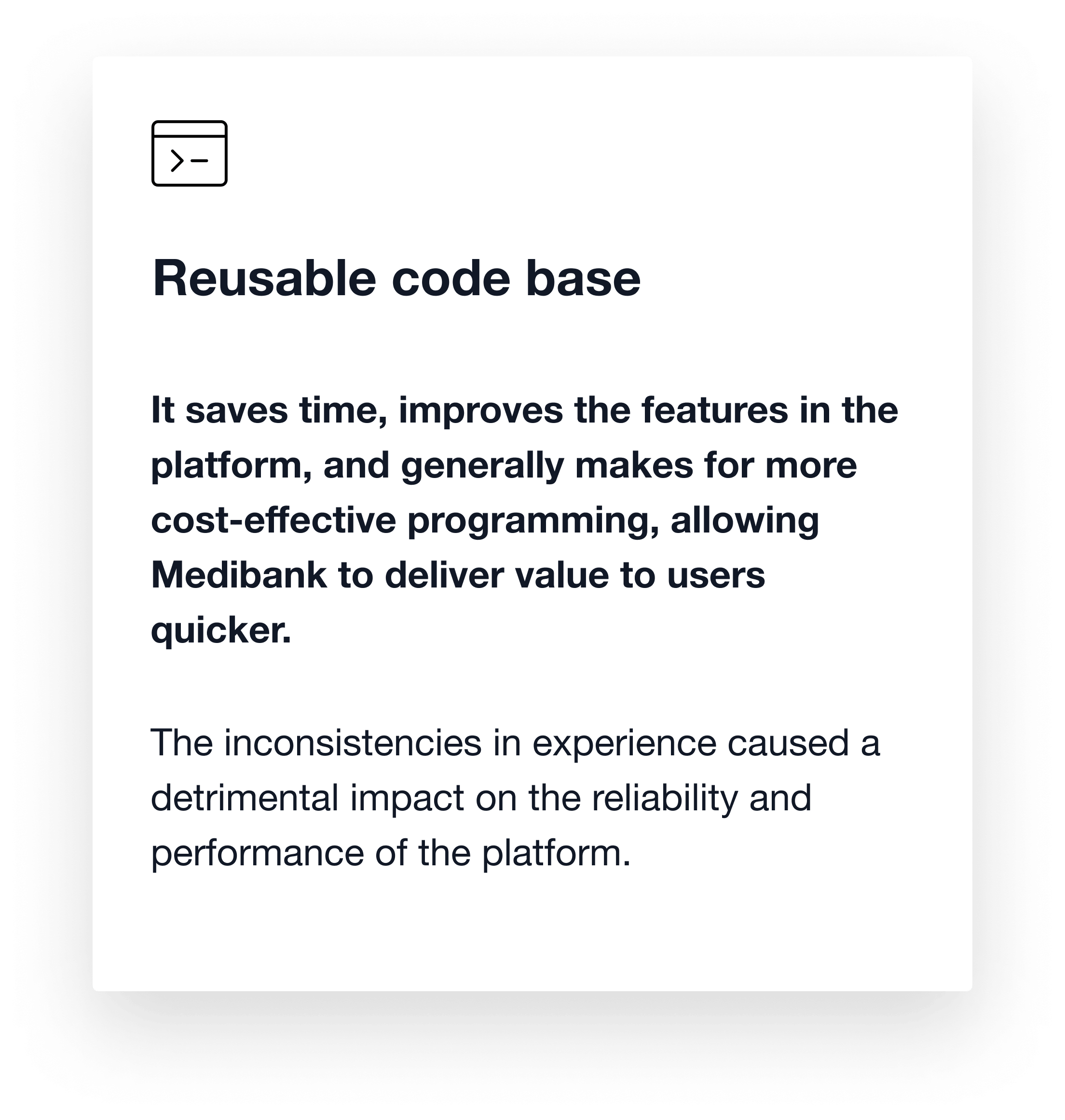
Scalable and reusable codebase
All components were designed and developed with scalability in mind, minimising the potential for design/development rework and helping to keep the application as simple and intuitive as possible. This allowed the team to re-use existing code and to keep the code base as light as possible. Some of these examples are shown below:

Optimised typography system
Leveraging learnings from various best practice design systems I created a 4px vertical and an 8px horizontal grid to optimise line height, letter and paragraph spacing for increased legibility and readability.

Robust colour palette & accessibility
Working in conjunction with the Retail team, who were developing the Medikit design system, I created My Medibank colour palette. Careful consideration was given to these colours as they needed to meet AA accessibility ratings when appearing with copy (contrast levels). These colours were a subset of the Medikit colour palette and were later used in the Helix Design System (app), print, social, video advertising and internal presentations.

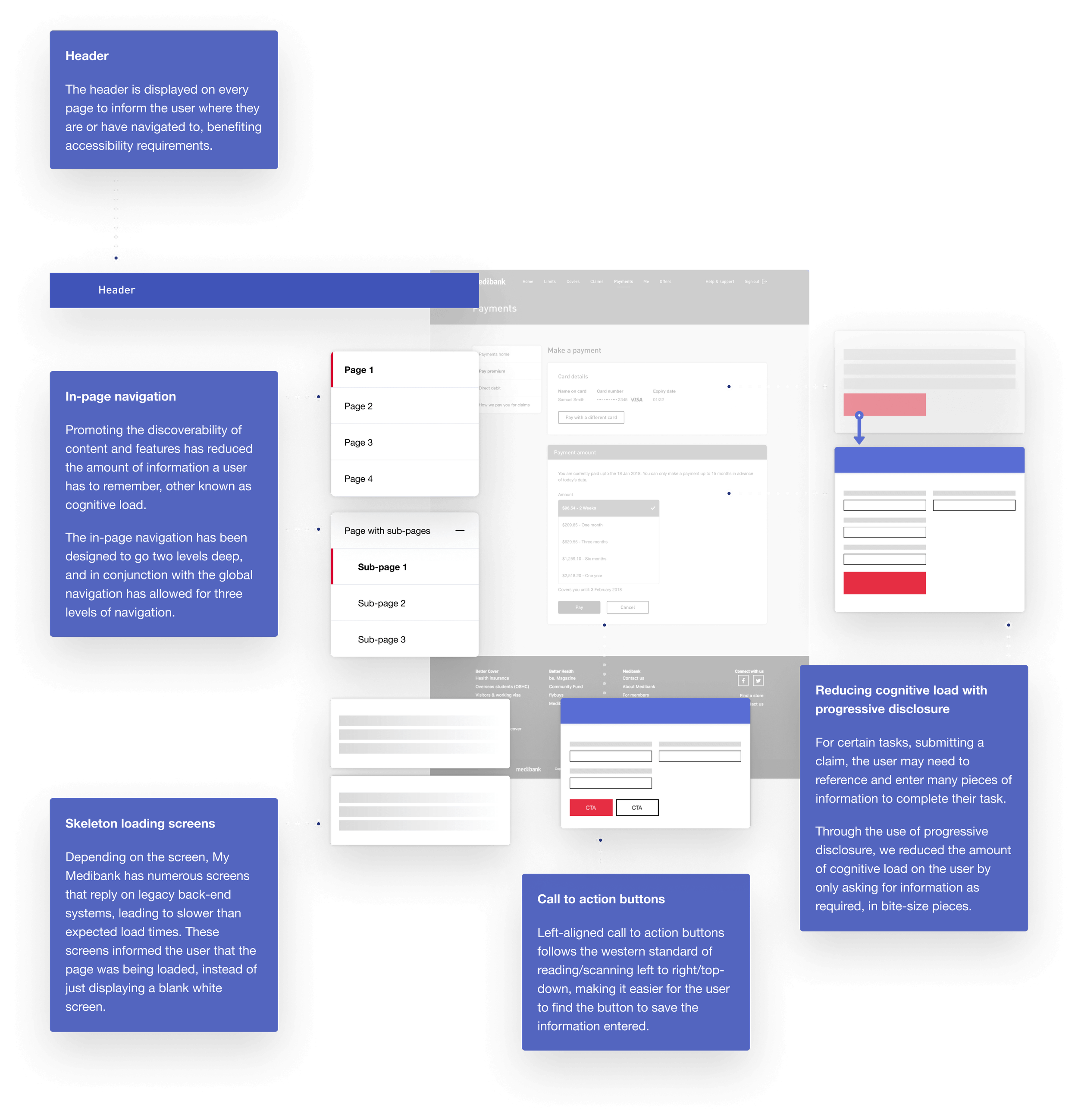
Accessible layout and components
Historically, Medibank’s digital products have not been very accessible. To make accessibility a higher priority Medibank committed to being AA compliant by 2024, and there is still a way to go. As a starting point for the My Medibank, I have incorporated focus order, alternative text for images and of course contrast ratios where text appears on a page.


Seeing the results
Over 15 months, as the product design lead on My Medibank, I was able to completely uplift the legacy design for all MVP pages.
You can see a few examples screens below:
Login and registration

Home

Payments

Me

Breaking it down
Cards - Primary and secondary
A selection of primary and secondary cards showing desktop and mobile variations that were used across numerous My Medibank pages.

Task-oriented pages
Within My Medibank there are a series of pages that users need for task-oriented scenarios, for example checking their limits and/or policy details, making a payment and/or claiming for a medical service they received. These pages had a similar page structure, giving users a sense of familiarity and allowing them to complete tasks quickly.
The impact
Positive results so far
The revamp of the My Medibank platform experience has had a positive impact on the users and the business.
Medibank can now update content (re-usable AEM components) without the need to schedule releases and implement code freezes. Letting My Medibank users get the information they need quicker, without waiting 10+ seconds for a page to load and being able to perform tasks as and when they would like to.
To comply with the confidentiality agreement with Medibank I have only shown high-level information.

Key learnings and takeaways
This project required myself and the team to work within aggressive timelines, redesigning and rebuilding the majority of the My Medibank application within 15 months. We met our timelines and goals, the design system was a worthwhile investment for the business and users and is a massive leap forward.
We can now design much faster now, only needing to focus on the solving the real problem(s) for our users and not having to worry about padding, colours and kind of type should be used where. Allowing developers to code faster and release features at a lower cost to the business.
One eye on the future
Always design with the future state in mind. If it loses value it will be thrown away in 6 months. Make sure the component can be progressively built up for upcoming features.
Accessibility from day one
It may be tempting to go crazy on the new components, but it will come back and haunt you. Design with accessibility in mind from the start and avoid having to rebuild a page/component to make your system inclusive.
Design with developers
Work with development from day one, they have a lot of knowledge and experience that you can learn from. It also helps to create that ‘we are all in it together’ feeling in the team, instead of designers just flinging designs over the fence. Do a quick spike to test the feasibility of certain patterns, it is no use when designs can’t be realised in code.
Multiple systems at the same time
As I’ve mentioned throughout this study, two designs systems were being developed at the same time, My Medibank Design System and the Retail Design System (Medikit). Throughout the project, this posed varying levels of logistical and design challenges, but this also opened up the opportunity for the two teams (designers/developers/stakeholders, etc) to work together and share a bit more empathy for each platform and envisage how this could be used for us to give our users a unified and coherent experience.