
Creating the new My Medibank experience
About Medibank
Medibank is Australia’s largest healthcare insurer, looking after the healthcare insurance needs of more than 3.8 million customers through the Medibank and ahm brands, distributing travel, life and pet insurance products. In addition, Medibank provides a range of health services in Australia including mental health support, preventative and better-integrated primary, care and after-hours health support.
Project
Overview
My Medibank (MYM) is Medibank self-service platform for its 3.8+ million Australian members. By 2019, My Medibank had been live for over 6+ years, with several designers working on a slew of features, My Medibank struggled to scale along with the growing expectations of its users, becoming a disjointed and fragmented experience. Alongside this, the platform’s reliability and the performance had degraded exponentially and was sorely due for an uplift from both a design and technology perspective.
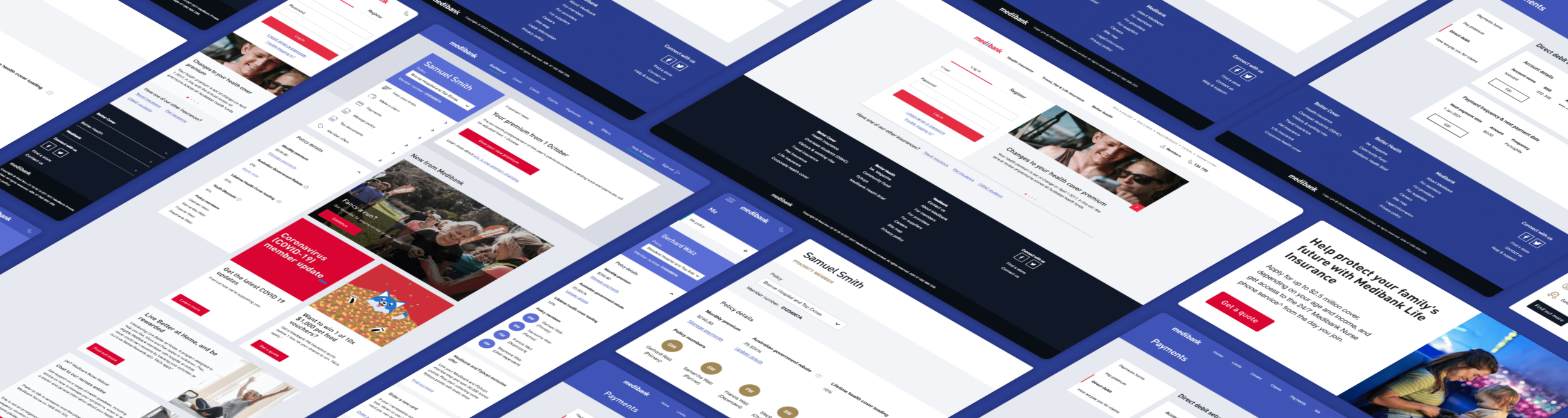
Old My Medibank screens - Old login/registration (left) - Cover page after user logs in (middle) - Manage policy (right)
My role: Product Design Lead
I led the end to end research, design and execution of the redesign. Being one of the first projects I had worked on since joining Medibank, my focus was to understand the internal workings of the business and its processes, craft strong relationships with stakeholders, and build an in-depth understanding of Medibank members.
Responsibilities included:
• End to end product strategy and design.
• Creation and management of the responsive My Medibank Design System.
• Managing communication between engineers, legal and business stakeholders.
• Translating business needs into actionable design plans.
• Research recruitment and facilitation.
• Liaise with My Medibank app team to ensure cross-platform consistency.
• Facilitation of brainstorming/ideation workshops, design reviews and presentations.
Tools used
Figma, Maze, Zeplin, Google Analytics, Askable
Timeline
February 2019 – March 2021

The challenge


Design philosophy
Use the power of design to make My Medibank as simple as possible for users.
With Medibank’s broad user base, our data showed that our users could be someone with an old desktop computer to a tech-savvy individual with the latest smartphone. For this reason, the design had to be easy and predictable, align with known mental models allowing more users to get the most value from their cover.

Design process
I employed a 4-stage framework:
1 Empathise
Researched, analysed and documented pain points
From the outset, we had a wealth of historical user feedback that had been captured by Medibank frontline staff. Categorising this feedback gave me a good high-level sense of the pain points our users had encountered over the previous 12 month period, the qualitative data. From a quantitative standpoint, diving into Google Analytics and reporting dashboards gave me an in-depth understanding of our users as they interacted and completed various tasks through My Medibank.
Listening to service calls
To get an in-depth understanding of our users, I booked in six days (over three weeks) where I took the opportunity to sit with Medibank frontline staff and listen to service calls, letting me understand some of the specific nuances of user pain points. Over various days and time blocks, I had individuals from our cross-functional team join these calls to help them harness a greater level of understanding of our user’s pain points and needs.

Historical customer feedback captured over a 12 month period.

Listening to customer service calls with Medibank frontline staff.
User pain points from service calls
“I’ve tried three times to register for My Medibank. I either get a blank or error page to try later. Why is it so hard? Can’t you just do it for me?”
“When can I get my tax statement? Should be ready by now!”
“I am unable to claim online. I enter all the required information and once it comes to step 3 it does not work anymore.”
2 Define
Competitive landscape and best practice
I completed a heuristic evaluation, benchmarking against our direct and indirect competitors, identifying where we sat in the market, and what features would deliver the most value for our users and Medibank. It was great to do this early on to see how this aligned with the Product teams assumptions. Then looking into best practice patterns for various screens/flows through My Medibank, i.e. looking at PayPal for payment flows and Energy Australia’s authenticated dashboard/home.
Analysis and user flows
It was important to break down our current user flows (alongside usage data) and analyse how our new optimised flows would solve for member and business needs, i.e. ease of information/feature discovery. It was important in this step to also look to validate our assumptions and hypothesis with both customers and technology to ensure viability and feasibility.

Competitive landscape - Heuristic evaluation to benchmark feature set and user experience.
Updated user flows for My Medibank that would be later evaluated in user testing with customers.

Sample process map that would be used to create designs for validation with users.
3 Ideate
Visualising ideas with Medibank
Before I could get into designing, it was important to get the teams ideas onto paper/whiteboard. Everyone had so many ideas and these ideation sessions were used to quickly generate/communicate along with the wider business teams. These sessions helped to keep everyone focused on solving for the needs of the user so that they would not be distracted by ‘pretty pictures’.

Setup and facilitated collaborative ideation workshops with various business units (Digital, Technology, CX, UX/Product design and more) to visualise ideas through paper prototypes.
Designing with users
Partnering with the Customer Experience (CX) team, I set up and facilitated two full-day design workshops with 40 Medibank users, who at that time had Medibank Health insurance with extras and hospital cover. We split them into groups over these two days where they completed different activities, including sketching what their ultimate My Medibank experience looked like, card sorting (to help with navigation structure), tree-jacking to test out design and business concepts for navigation.

Design workshop with customers.
User feedback from workshops
“Was a great exercise. I like that a company is testing their website for ease of access. Especially in healthcare when there is a lot of questions and an overload of information. Overall the tasks and steps to get the information were logical and quite succinct.”
“I enjoyed the experience. I would not have expected all of those various topics to be addressed by a private health insurer’s website. It will make me investigate my health providers website more when I do need to make a claim. The sense I got was that this provider cares for their clients, for example providing advice for care after hospital, or providing a list of local specialists.”
Reframing the problem with business and user concepts
Design wall with all the unique concepts visualised by users and the wider business team. This was used as a launching pad to help consolidate all the different ideas into one set of wireframes that would be evaluated with users in testing.

Design wall of unique customer and business team ideas.

Refinement of ideas to create a single set of wireframes that would be validated with users in user testing.
4 Prototype and test (repeat)
Validating and refining concepts
To help inform design and business concepts/decisions, I conducted a series of usability studies with existing Medibank health members and non-members. These included qualitative usability studies, where they were asked to complete a series of tasks based on prototyped solutions. Between each round of testing, prototypes were updated and put back in front of customers to foster feedback for further refinement.
Additionally, a quantitative study was run with a separate group of 50 online customers, where they were asked to complete a card sorting and tree-jacking exercise to help us further refine our navigation structure and naming conventions.
Used a combination of lo-fidelity and hi-fidelity concepts to evaluate concepts with customers.

Sample of lo-fidelity and hi-fidelity concepts for user testing sessions.

User testing session with a younger user.

User testing session with an older user.

Sample screens of user testing pack that was presented back to business team after final round of testing.

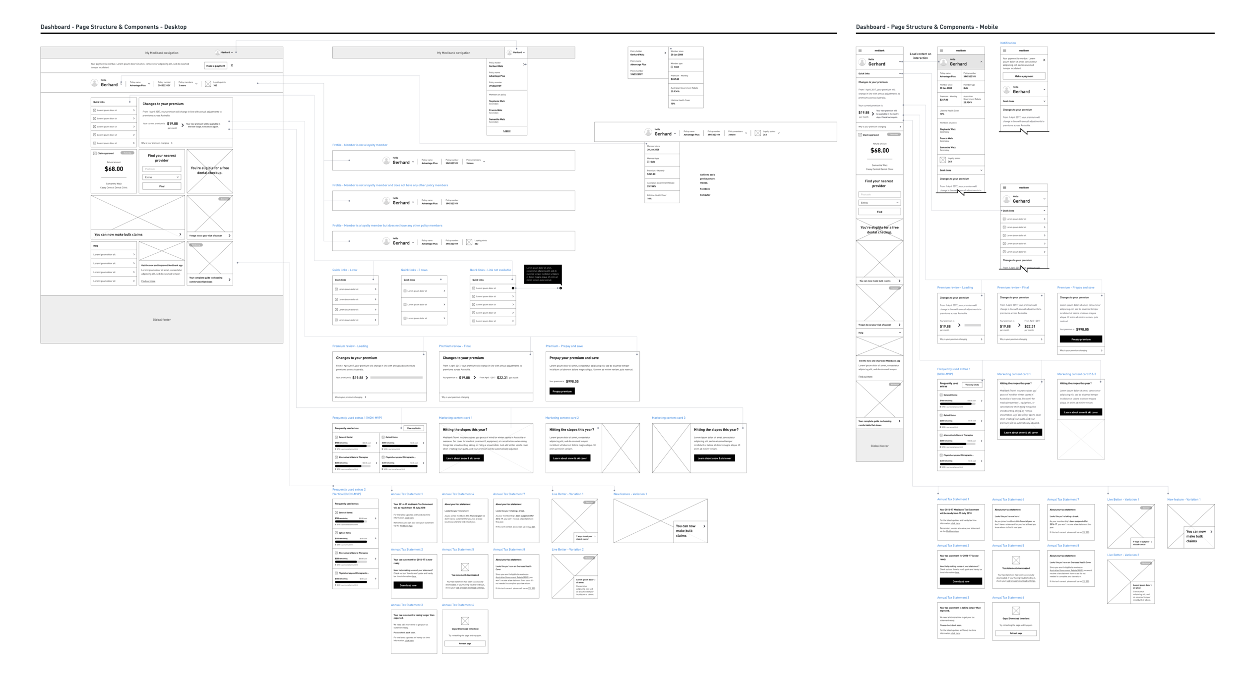
Multi-phase release plan
Being a self-service platform with 100+ individual pages, the entirety of the redesign was launched over multiple releases, spanning 18 months (plus ongoing enhancements). The ability for Medibank to author and manage content via Adobe Experience Manager (AEM), and the development of the platform using React components played an integral role in the design and maintenance of the My Medibank Design System.


The solution
Introducing the new My Medibank


Breaking it down


Home
View of Home screen once a user has logged into My Medibank.

Breaking it down

Policy selection
Policy selector variations with standard and priority member versions.

Cards - Primary and secondary
A selection of primary and secondary cards showing desktop and mobile variations.


Task-oriented pages
Within My Medibank there are a series of pages that users need for task-oriented scenarios. For example, checking their limits and/or policy details, making a payment and/or claiming for a medical service they received.
Breaking it down

Limits
The limits page allows users to view extras and hospital services usage, displaying detail down to individual/combined to lifetime usage.
For tactical reasons, the limits page was one of two areas of My Medibank not revamped along with the rest of the self-service platform. Claims did have a visual uplift to bring it in line with the rest of My Medibank and offer users a synchronised experience.

Covers
The covers pages allow users to view details for their health, travel, life, pet, funeral and income protection insurance.


Claims
The claims page allows users to submit an extras (single and multiple in one claim submission), pharmacy, hospital/medical (downloadable form), and compensation claims. To help users track the progress of their claim(s) there is a claims history area where the status of their claims submission is displayed.
For tactical reasons, the claims page was one of two areas of My Medibank not revamped along with the rest of the self-service platform. Claims did have a visual uplift to bring it in line with the rest of My Medibank and offer users a synchronised experience.

Payments
Payments pages allow users to manage their payment methods, payment history, make premium payments, set up and manage their direct debit and set how they would like to be paid for claims.


Me
Me pages allow users to manage their cover, access tax documents, update their login and contact details, manage their Australian Government Rebate (AGR) details and mail to name a few.

Priority member variant


Offers
The offers page allows users to view current offers by Medibank for their range of insurance products. The power of AEM and content fragments comes into play on these types of pages where business authors only need to place content in AEM and it is linked and filtered through to all pages that contain a particular card.

Help & support
A dedicated page where users can access answers and/or be navigated to further information about the most commonly asked questions.

The impact
Positive results so far
The revamp of the My Medibank platform experience has had a positive impact both on the users and the business.
Medibank now has the ability to update content (re-usable components) without the need to schedule releases and implementing code freezes. Letting My Medibank users get the information they need quicker, without waiting 10+ seconds for a page to load and being able to perform tasks as and when they would like to.
To comply with the confidentiality agreement with Medibank I have only shown high-level information.

There is more to do
The Limits and Claims pages have not been revamped and frontline staff get reasonable call volumes relating to customers enquiring about:

Key learnings and takeaways
Our users
Knowing that My Medibank’s users ranged from 18 to 65+ years of age, a key aspect was to understand our user’s pain points vs Medibank’s assumption. From a quantitative standpoint, diving into Google Analytics data and reporting dashboards gave me an in-depth understanding of our users through various touch-points and tasks throughout My Medibank. From this baseline, I was able to negotiate time and budget to understand our users from a qualitative standpoint (listening to service calls, workshops with users and numerous rounds of user testing), which proved crucial to validating potential solutions.
Business stakeholders
Building strong/trusting relationships with stakeholders, from various parts of the business (digital/CX, frontline, etc), was crucial not only for the start of the revamp, but also for the continual development and improvement of the platform.
Development team
Speaking with our development team regularly became more and more important as the solutions developed. Having a vision of where I believed the design system would progress was important as this allowed me to build empathy with the development team, and have code developed in such a way that it would allow for more efficient uplift of components in future iterations saving the business precious time and money.
Continuous improvement
My Medibank from its initial release to years later is a living entity. It will never be 100% perfect as the business and user needs change over the time, the important point to remember here is that its design system can change with the needs of the business and users.