Choosing the right health insurance for you
About Medibank
Medibank is Australia’s largest healthcare insurer, looking after the healthcare insurance needs of more than 3.8 million customers through the Medibank and ahm brands, distributing travel, life and pet insurance products. In addition, Medibank provides a range of health services in Australia including mental health support, preventative and better integrated primary, care and after-hours health support.
Project
Overview
In 2017, comparing health insurance products felt quick and easy. By 2020, due to a variety of internal and government initiatives this ease had been slowly eroded away to a point where it was difficult for customers to compare Medibank health insurance products.
I was a part of an ambitious project to improve the Medibank product sales comparison experience.
My role: Product Design Lead
I led the end to end research and design of the Medibank health insurance product sales comparison table. My focus was to understand the user and business pain points with the existing products sales cards and create an experience for our users to easily compare health insurance side-by-side. Along the way, communicating the benefits of design systems and building strong relationships with various digital and business stakeholders.
Responsibilities included:
• End to end research and design.
• Managing communication between engineers, legal and business stakeholders.
• Translating business needs into actionable design plans.
• Research recruitment and facilitation.
• Liaise with Medibank Retail Web team to ensure cross-platform consistency in their design systems.
• Facilitation of brainstorming/ideation workshops, design reviews and presentations.
Tools used
Figma, Zeplin
Timeline
June 2020 – September 2020

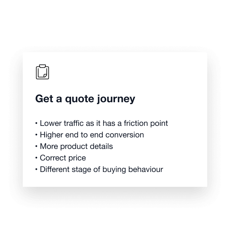
Journey flows
There are two main flows users follow to get a health insurance quote, known as the Quote and Scale flow. These are shown below:


Journey behaviours

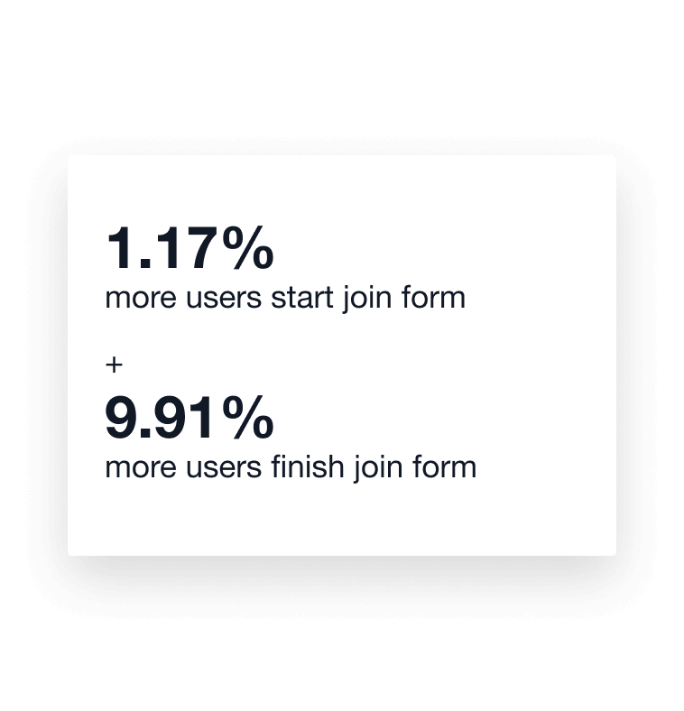

Quote (left) vs Scale (right) flow conversion.

Getting to work
Analytics tell the story
Initially, the project started with business stakeholders wanting to develop a compare feature that would allow our users to compare two products side-by-side. With a maximum of 27 products being able to be displayed at one time this was not a bad hypothesis.
Our data analytics specialist and I, through Google Analytics, discovered that our users were navigating back and forth between the Product Comparison and the Product Detail page. By understanding interaction flows for these pages we saw that users were navigating between these pages in search of the product information that they needed to help them compare products.

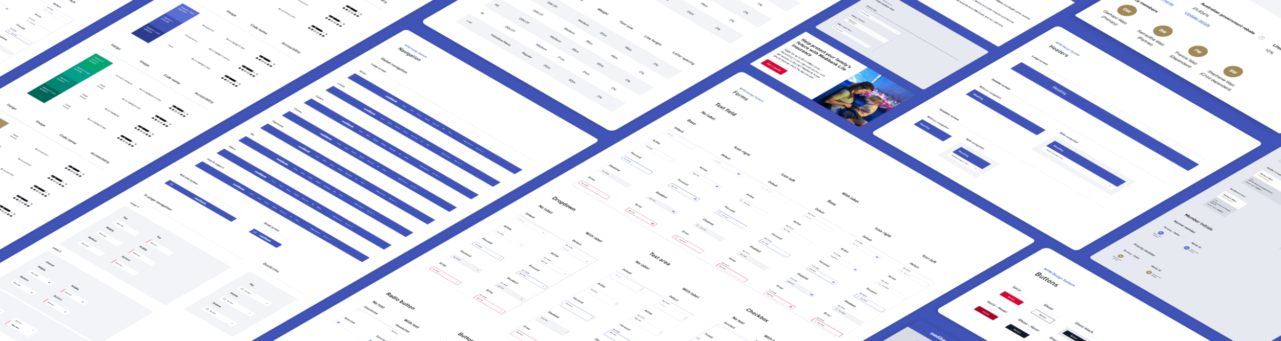
Sample of the guidelines and design language systems that I researched.
What our users had already told us
In late 2019, Medibank conducted an in-depth competitor study with Testmate. Medibank’s Quote and Scales journeys were analysed against 9 health insurance competitor sales journeys, competitors included NIB, Qantas, AAMI, Australian Unity, HCF and BUPA.


Area’s for improvement and recommendations
Overall, Medibank’s Quote and Scales flow ranked 2nd and 8th out of the 9 competitors respectively. There was a number of area’s for improvement were identified for both flows, these included:

The study also listed a set of recommendations for Medibank’s consideration, these included:

Understanding how others do comparison
By this point, I had a fair understanding of what our users expected from their health insurance comparison journey. One question remained, how and what do our direct (changes since the Testmate study) and indirect competitors present to their users when they want to compare products? I pulled together a list of our competitor’s and a set of market-leading retailers/businesses, these included:
Indirect competitors
Harvey Norman - Laptops
The Good Guys - Televisions
Appliances Online - Televisions (4k Smart TV’s)
Canstar - Home loans
Commbank - Credit cards
Westpac - Credit cards
Direct competitors
GMHBA
HCF
Compare the market
privatehealth.gov.au
Finder.com.au
Each competitors comparison journey was documented as shown below:

Subset of direct and indirect competitor comparison flows.
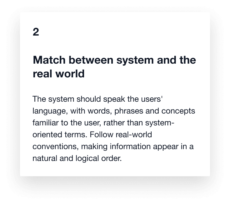
I used a heuristic evaluation to complete a detailed analysis of each competitor’s comparison journey/features. The heuristic evaluation allowed me to focus on each competitor's comparison flow's usability aspects. Each competitor was evaluated on each of the following 10 usability heuristics (Nielsen Norman Group):


Rating each competitor on the heuristics and capturing details as I progressed, as shown below:
Heauristic evaluation (left) and Special callouts/comments for each competitor (right)
Not what we thought it would be
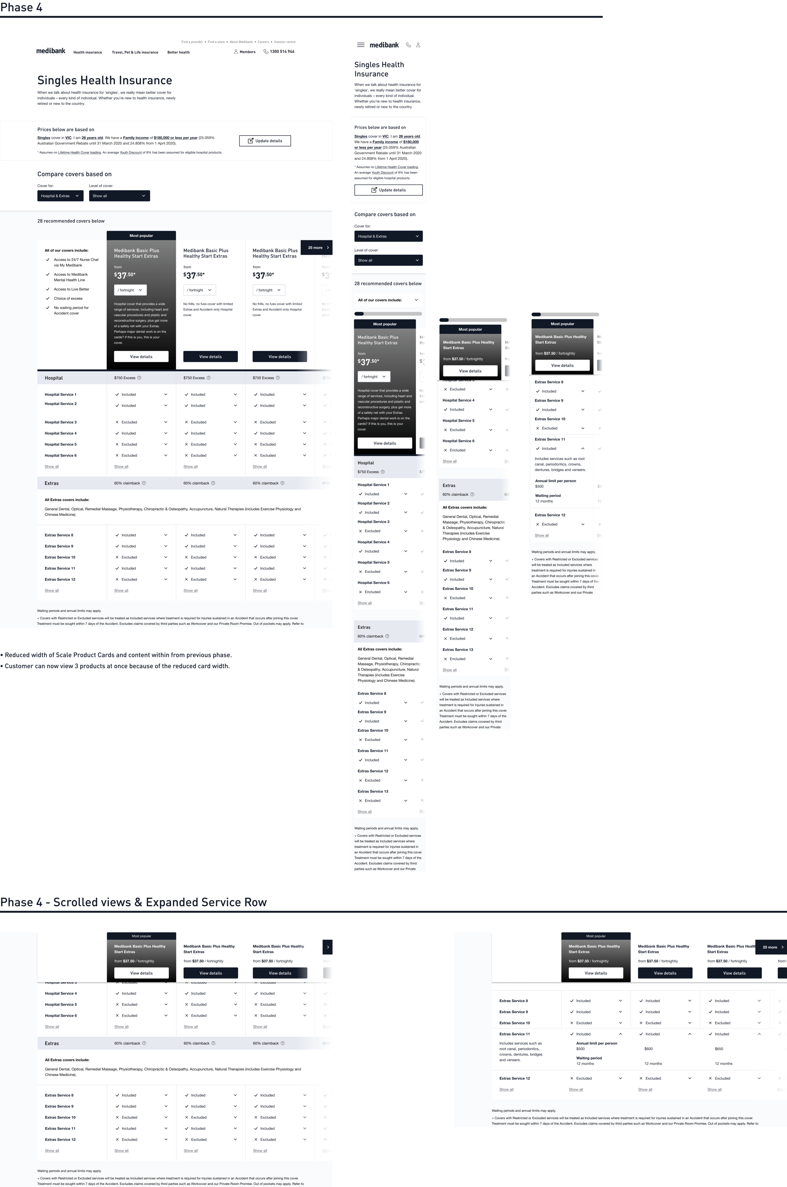
Consolidating the data gathered, the discovery team and I hypothesised that adding a Compare Two Products feature to the existing Product Comparison page would not solve the problem that we were trying to solve for our users. We needed to go further and give our users the flexibility to access the information they needed on the Product Comparison page. Through a series of wireframes, I formulated a concept for review with the discovery team, where I proposed a potential iterative approach for design and development.


Approving the pivot
With a ~30% increase in design and development effort, the time had come to get approval from the executive leadership to pivot our proposed solution and deliver the right solution for our users. Taking the lead, I crafted and presented (with support from our Product Owner) our findings and recommendations for approval. Below is a sample set of slides that were presented:
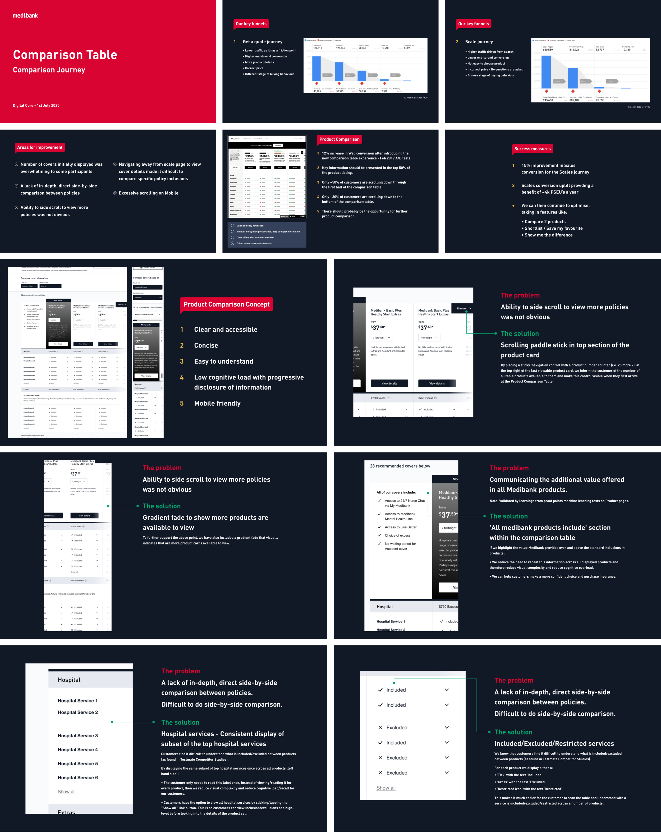
Sample of presentation slides for executive leadership.

The solution